The Resume
The Resume
The Resume
CASE STUDY: PRUDNETIAL
Design System
Building an enterprise-wide design system that unified design, development, accessibility, and brand across Prudential's digital ecosystem.
PROJECT AT A GLANCE
ROLE
Director, UI/UX • 2015 - 19
PLATFORM
Enterprise Design System
USERS
Global Commercial Banking Teams
PRIMARY RESPONSIBILITIES
-
Design Leadership
-
Design System Strategy
-
UI Architecture
-
Component Library Design
-
Visual Design
-
Design Governance
-
Team Leadership
-
Accessibility Standards
-
Cross-functional Collaboration
-
CMS Strategy
-
Quality Assurance
-
Enterprise Design Support

THE CHALLENGE
When I joined Prudential, there wasn't a true digital design system.
Different business units had developed their own approaches to color, typography, layouts, coding standards, accessibility, and responsive behavior. Some experiences followed the corporate brand, others interpreted it differently, and many simply evolved independently over time.
As Prudential's digital presence continued to grow, these inconsistencies became increasingly difficult to manage. Every new project required unnecessary design effort, developers rebuilt similar components repeatedly, and accessibility compliance depended heavily on the individual teams involved.
The challenge wasn't creating another UI library—it was establishing a shared language that could be adopted across an entire enterprise.
WHAT MADE THIS PROJECT HARD?
No Single Source of Truth
Each business unit had developed its own design standards, making consistency nearly impossible across the organization.
Accessibility Couldn't Be Optional
Every component needed to meet ADA requirements by default instead of relying on individual project teams to remember accessibility standards.
Brand Was Built for Print
Existing corporate guidelines worked well for traditional marketing but provided little guidance for modern digital products and responsive experiences.
Technology Was Constantly Changing
The system needed to evolve with new browsers, devices, interaction patterns, and design trends without becoming obsolete.
Multiple Teams, One System
The design system needed to support designers, developers, researchers, marketing teams, compliance, and business stakeholders simultaneously.
Enterprise Adoption
Building the system was only half the challenge. Success depended on convincing teams across Prudential to adopt it as their primary way of working.
MY APPROACH
Audit Existing Products
Identify Common Patterns
Standardize Foundations
Build Component LIbrary
Integrate CMS
Establish Governance
Support Product Teams
Refine & Expand
UNDERSTANDING THE PROBLEM
It quickly became clear that the inconsistency wasn't caused by poor designers or developers. Everyone was solving similar problems, but they were solving them independently.
Different teams had different color palettes, different typography standards, different coding practices, and different interpretations of the corporate brand. Existing brand guidelines focused primarily on print and marketing materials, offering very little direction for responsive websites, enterprise applications, or mobile experiences.
At the same time, the UX team was spending an enormous amount of time recreating components that had already been designed elsewhere. Instead of focusing on innovation and solving new user problems, much of the team's effort went toward rebuilding familiar patterns for every new project.
The opportunity wasn't simply to standardize interfaces—it was to fundamentally change how Prudential designed, built, and maintained digital products.

STRATEGIC DECISION 1: BUILD A SYSTEM, NOT A STYLEGUIDE
The Challenge
Design consistency wasn't failing because teams lacked talent—it was failing because they lacked shared tools. Existing guidelines documented branding but didn't provide reusable components or implementation standards that designers and developers could rely on every day.
My Decision
Rather than producing another brand manual, we created a comprehensive design system built around Atomic Design principles. Reusable components, page templates, interaction patterns, accessibility standards, and responsive behaviors became the foundation for every new project.
The system wasn't intended to document design—it was intended to produce it.
Why It Mattered
The shift from documentation to reusable components dramatically reduced duplicated effort across the organization. Teams could begin new projects using proven building blocks instead of recreating common interfaces from scratch, improving both speed and consistency across Prudential's growing digital ecosystem.

STRATEGIC DECISION 2: DESIGN FOR ENTERPRISE ADOPTION
The Challenge
A design system has little value if teams choose not to use it. Different business units had established workflows, external agencies contributed new experiences, and development teams needed flexibility while still maintaining consistency.
My Decision
I focused on creating a system that balanced governance with usability. The design language remained flexible enough to support different business needs while establishing clear standards for color, typography, accessibility, responsive behavior, and component usage. I also served as the primary UI resource for teams across the organization, helping guide adoption and ensuring quality as new products were developed.
Why It Mattered
Because the system was practical rather than restrictive, it gained support across multiple departments and eventually became the primary point of reference for digital design. Teams could move faster while maintaining consistency, reducing onboarding time for new designers, and improving collaboration between design and development.

STRATEGIC DECISION 3: TREAT THE DESIGN SYSTEM LIKE A PRODUCT
The Challenge
Unlike traditional projects, a design system is never truly finished. New technologies, accessibility standards, branding updates, and user expectations continually create new requirements.
My Decision
Instead of treating the system as a completed deliverable, I managed it as an evolving product. I continuously refined components, reviewed design quality across projects, collaborated with front-end development and executive leadership on improvements, and led the UI team in expanding the system as Prudential's digital needs evolved.
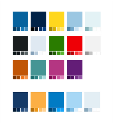
In 2018, I also led a comprehensive visual redesign intended to strengthen Prudential's unique identity by reducing its reliance on generic Bootstrap styling and creating a more recognizable visual language.
Why It Mattered
Viewing the design system as a living product ensured it remained relevant long after its initial release. It became more than a component library—it became the foundation for how Prudential designed, built, and maintained digital experiences across the enterprise.

WHAT I LEARNED
"By the end of this initiative, I understood that successful design systems are really organizational products".
This project fundamentally changed how I think about design systems.
Before this experience, I viewed them primarily as tools for consistency. Afterward, I began seeing them as living frameworks that should evolve alongside new products, platforms, and user expectations.
It also reinforced the importance of decisive leadership during periods of uncertainty. There are moments when collaboration is essential, and there are moments when someone must take ownership, make informed decisions, and move the work forward. Knowing the difference is one of the most valuable lessons I've carried throughout my career.
Most importantly, the project reminded me that great mobile experiences aren't created by shrinking desktop ideas—they're created by embracing the unique strengths of the platform from the very beginning.
OUTCOMES
The design system changed how digital products were created across Prudential.
Key outcomes included:
-
Reduced project timelines by approximately 30% from concept to launch.
-
Reduced designer and developer onboarding time by 25%.
-
Established a single source of truth for enterprise digital design.
-
Improved accessibility compliance across digital products.
-
Enabled individual business units to build experiences while maintaining consistency.
-
Allowed the UX organization to spend less time recreating common components and more time solving new user problems.
-
Influenced design work beyond digital, including marketing and print initiatives.
LOOKING BACK...
Looking back, I'm proud of what the design system accomplished and the impact it had across the organization. Creating a single source of truth for design, development, and accessibility fundamentally changed how Prudential approached digital experiences.
If I were beginning the project today, I would position the design system even more intentionally as a product with its own roadmap, dedicated metrics, and long-term ownership. While the system evolved continuously, treating it as a formal product from the outset would have made it easier to prioritize enhancements, measure adoption, and communicate its business value across the enterprise.
The redesign effort in 2018 also reinforced an important lesson: consistency should never come at the expense of identity. Design systems should establish shared foundations, but they must also evolve with the brand and the expectations of modern users. The most successful systems balance structure with flexibility, allowing products to feel cohesive without becoming interchangeable.