The Resume
The Resume
The Resume
CASE STUDY: IFF
4D Dashboard
Recovering a stalled enterprise project and building a modular R&D management platform.
PROJECT AT A GLANCE
ROLE
Lead UX/UI Designer • 2019
PLATFORM
Enterprise Web App
USERS
Flavor R&D Project Managers
PRIMARY RESPONSIBILITIES
-
UX Research
-
Product Strategy
-
Information Architecture
-
Dashboard Design
-
Interaction Design
-
Responsive UI Design
-
Stakeholder Facilitation
-
Developer Collaboration
%20All.jpg)
THE CHALLENGE
When I joined IFF, the 4D Dashboard project had already fallen six months behind schedule.
The business had lost confidence in the project, development had little direction, and the design work had stalled before meaningful UI concepts had been produced. Four project managers and their supervisor were responsible for tracking more than one hundred active research projects using spreadsheets, making it difficult to understand project status, identify bottlenecks, or communicate progress across teams.
Before designing a single screen, my first responsibility was rebuilding alignment between business stakeholders, development, and leadership.

WHAT MADE THIS PROJECT HARD?
Project Already Off Track
When I joined the project, development was already six months behind schedule. Business stakeholders had lost confidence that the product would ever be delivered.
Four Users, Four Workflows
Although the application only served four project managers, each managed projects differently and expected unique filtering, sorting, and reporting capabilities.
Rebuilding Trust
Before designing anything, I needed to reconnect business leaders, developers, and IT leadership around a shared understanding of priorities, expectations, and scope.
Designing for Future Growth
The first release solved today's problems, but every design decision also had to support additional dashboards, modules, and workflows planned for later phases.
Complex Data
Each project contained dozens of interconnected data points spanning research phases, ingredients, timelines, approvals, and
commercialization readiness that needed to remain easy to understand.
Limited Time to Deliver
The immediate objective wasn't perfection—it was getting a stalled project moving again with a practical, modular solution that development could realistically build.
MY APPROACH
Research
Requirements
Whiteboards
Wireframes
Visual Design
Design System
Developement
UNDERSTANDING THE PROBLEM
Instead of immediately producing mockups, I reviewed months of existing research, previous design work, technical documentation, and notes from earlier workshops.
Afterward, I organized new conversations with the project managers while ensuring development and IT leadership participated in every discussion.
The goal wasn't simply to gather requirements—it was to rebuild confidence that the project was moving in the right direction.
Those meetings uncovered something the previous effort had struggled with:
Although there were only four primary users, each managed projects differently and wanted different ways of organizing the same information.
That realization fundamentally changed how I approached the interface.

STRATEGIC DECISION 1: START SIMPLE, THEN SCALE
The Challenge
Although users requested advanced functionality—including Kanban boards, multiple project views, reporting, and automation—the project was already six months behind schedule and had yet to establish a usable foundation.
My Decision
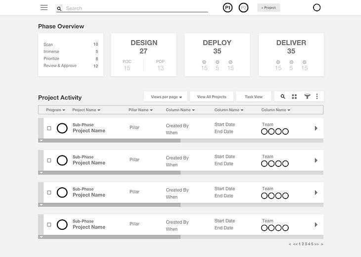
Rather than attempting to deliver every requested feature in the first release, I focused on building a clean, spreadsheet replacement that solved the team's immediate needs while establishing a framework for future enhancements.
The dashboard emphasized project creation, editing, searching, sorting, and high-level project status, with more advanced capabilities planned for later phases.
Why It Mattered
By prioritizing core workflows first, the project became more achievable for both the business and development teams while creating a scalable foundation for future functionality.


STRATEGIC DECISION 2: DESIGN FOR MULTIPLE MENTAL MODELS
The Challenge
Although there were only four primary users, each organized projects differently. Some preferred searching, others filtering, and others wanted to browse projects visually.
My Decision
Instead of optimizing the interface around a single workflow, I designed the dashboard to support multiple methods of finding information through search, filtering, sortable tables, and future alternate views such as Kanban boards.
The experience focused on allowing users to work the way they naturally think rather than forcing everyone into a single process.
Why It Mattered
Supporting multiple approaches increased flexibility without significantly increasing interface complexity, making the dashboard easier to adopt across the entire team.

STRATEGIC DECISION 3: BUILD FOR THE NEXT PHASE, NOT JUST THIS ONE
The Challenge
The initial release represented only the first phase of a much larger product roadmap. Future functionality would introduce significantly more data, reporting, analytics, and workflow management.
My Decision
I created a modular layout based on a responsive 12-column grid and reusable interface patterns that could accommodate additional dashboards, project views, and reporting modules without requiring a complete redesign.
Each screen was designed to grow alongside the product.
Why It Mattered
Thinking beyond the immediate requirements reduced future design debt and provided development with a flexible framework that could evolve as business needs expanded.


WHAT I LEARNED
"The biggest challenge wasn't designing the dashboard - it was rebuilding alignment between people. Once everyone shared the same vision, the interface became the easy part."
Building Software Starts with Building Trust
When I joined the project, the biggest challenge wasn't the interface—it was rebuilding confidence. The business had lost faith in the project's progress, development lacked clear direction, and months of work had resulted in very little forward momentum. Before I could begin designing, I needed to make sure everyone felt heard and was working toward the same goal.
This project reinforced something I've experienced throughout my career: successful UX isn't created by designers working in isolation. It comes from bringing together business stakeholders, developers, and end users around a shared understanding of the problem. Once that alignment exists, the interface becomes much easier to design.
It also reminded me that solving every problem at once is rarely the right approach. By focusing on the core workflows first and designing a flexible foundation, we created a solution that addressed immediate business needs while leaving room for future growth. Sometimes the most valuable design decision is knowing what not to build yet.
More than anything, this project strengthened my belief that good enterprise design isn't measured by the number of features on the screen—it's measured by how clearly it helps people accomplish their work while giving organizations confidence that the product can evolve over time.
SYSTEM THINKING
Grid
Components
Responsive behavior
Design tokens
Future scalability
NEXT STEPS
Phase 2 would have included:
Kanban
Analytics
Reporting
Automation
Role Permissions
LOOKING BACK...
If I were approaching this project today, there isn't much I would change about the process itself. Rebuilding trust among the business, development, and IT leadership proved just as important as the design work. Taking the time to revisit the research, ask questions that had already been asked, and ensure everyone felt heard created the alignment the project needed before meaningful progress could be made. Those conversations not only strengthened the project but also introduced me to some incredibly knowledgeable people whose perspectives shaped the final direction.
Visually, however, I would make different choices. At the time, I leaned heavily into IFF's brand palette and popular design trends, resulting in an interface with more visual energy than the product truly needed. Looking back, I would simplify the color usage, reduce the prominence of decorative elements, and create a calmer visual hierarchy that allows the data - not the interface - to command the user's attention.
Like many designers, I can see every decision I would refine years later, but I view that as evidence of growth rather than regret. The experience reinforced an important lesson that continues to influence my work today: enterprise software succeeds when visual design supports the workflow instead of competing with it.