The Resume
The Resume
The Resume
SNAPSHOT: PRUDENTIAL
Global
Footer
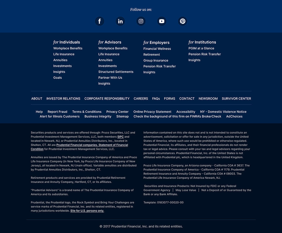
Reimagined a foundational website component to improve readability, brand consistency, and usability while supporting accessibility and legal requirements.
ROLE
Director, UI/UX Design • 2015-19
SKILLS DEMONSTRATED
UI Design
Information Architecture
Accessibility
Design Systems
Enterprise UX
CHALLENGE
The global footer served as the final touchpoint across Prudential's public website, housing legal disclosures, corporate navigation, and customer support resources. Over time, the component had become oversized, visually disconnected from the brand, and difficult to maintain while still meeting legal and accessibility requirements.
OUTCOME
Created a streamlined footer framework that improved legibility, reinforced brand consistency, and established a stronger foundation for future site-wide experiences.
Navigation Architecture
Restructured legal disclosures, navigation links, and supporting content into a clearer layout that improved readability while reducing visual clutter.

Brand Integration
Applied updated brand colors, spacing, and visual standards to create stronger continuity between the footer and the rest of the experience.

Component Modernization
Refined the footer into a more flexible and scalable component capable of supporting future content needs without increasing complexity.

KEY TAKEAWAYS
Redesigned the global footer to improve readability, strengthen brand consistency, and better support legal, accessibility, and navigation requirements.
Reorganized legal content, navigation, and social media elements into a cleaner, more structured layout that reduced visual clutter and improved scanability.
Used updated brand standards, color hierarchy, and reusable UI patterns to create a footer that complemented the overall experience instead of feeling like an isolated component.