The Resume
The Resume
The Resume


Morgan Stanley PerfLink
An internal experience for tracking customer performance over time and balance amount
Dashboards always seem like pretty straightforward projects; provide the user with the data they need, when they need it in the experience. Where it gets complicated is what the user wants to do with that data when they get it, and PerfLink is no exception.
I often encounter challenges in my career when working with users who have relied on established programs for decades. Some of these users have been using Microsoft Office for so long that they automatically expect every cell in a data table to be editable. They also assume that all charts and graphs can be manipulated, enabling them to view information from a high-level overview down to individual data points within a specific 15-minute window.
While I understand their needs, I can't always fulfill their requests. In some instances, the data cannot be manipulated because it originates from another source that must be altered there. In other cases, technical limitations arise, especially when using third-party programs.
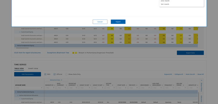
PerfLink may appear to be a simple tool for building data tables—users request specific data points to generate a table—but it becomes complicated when you consider that the tables can have three or more levels of data for a single client. The tables need to indicate upward or downward movement using specific font colors (not the whole cell), users want to highlight certain cells, and there should be two tables generated: one displaying upward and downward movement and another showing overall movement over specific periods.
Not to mention the ability to download the tables into Excel or PDF format so they can either be manipulated and reloaded back into the system, or used for presentations to clients or senior leadership. There is a lot of discussion of what the overall workflow is, then breaking that down into smaller steps and building to the larger experience.
An added complexity of these tables is the users' ability to sort and search through columns, which requires significant space on the page. Initially, each column had its own header, but the labels were too long to display properly, leading to excessive truncation that made them unreadable. To address this issue, we carefully redesigned the content of the labels and introduced a "parent" column, which helped simplify the presentation.
The work presented here marked the start of a larger initiative, laying the foundation for Morgan Stanley to not only expand in the future but also to create a more extensive dashboard ecosystem.
As complicated as this dashboard experience is, it is not my most complex to date.
Thanks for reading.


