The Resume
The Resume
The Resume


Morgan Stanley Document Search
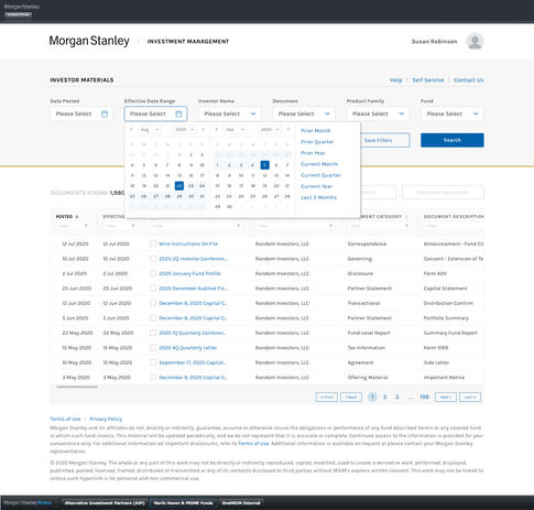
An authenticated, client facing mockup for finding and downloading documents.
Morgan Stanley, like all financial institutions, is required to provide a variety of documents to its clients. The ability for clients to efficiently locate these documents can make a significant difference in whether they choose to use a new product or end up contacting the legal department.
This page may not be glamorous; it is simply a search page. However, this project marks the beginning of unifying all internal and authenticated experiences at Morgan Stanley with a consistent look and feel—something that has been significantly lacking.
While this project may not be groundbreaking in terms of design and interaction, it highlights the diplomacy required when a designer is part of a larger organization. Freelance designers or those in independent studios often find that their suggestions are more readily heard. In contrast, when designers are part of an internal team, their ideas may not receive the same level of attention for various reasons.
I was tasked with visually improving the document search feature and collaborating with the development team to implement the user experience. The biggest challenge I encountered was with the search fields located at the top of the page. As users navigate from left to right, the choices in the preceding search field dictate the available options in the following fields. For example, when searching for a TV, if you specify a particular make, model, and size, the options in subsequent fields become increasingly limited as you refine your criteria.
The head of the development team and her team created the screens according to the visual specifications. However, we began to disagree on the functionality of the search fields. I believed that once a user made a selection in a field, that choice should be "locked in." In contrast, during development, it was designed so that as users navigated to the right, their previous selections could be altered without any indication that a change had occurred.
My argument was that this creates a bad user experience (UX). If something changes and can affect the results users are seeking, they should be made aware of it. She argued that "our users know that if they choose one option, they will only receive specific results." Frankly, this is a significant assumption. What if the user is new to the platform? What if they are new to the industry or the company altogether? Are we expecting them to just "know"?
We had a productive discussion and agreed that if the previous data field changes, a field-level alert will notify the user of the change. A diplomatic solution that resulted in a better experience for our users.
Simple, effective, and good UX.
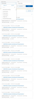
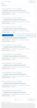
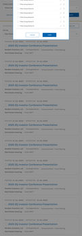
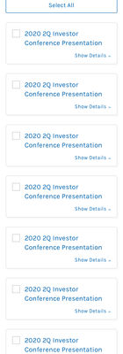
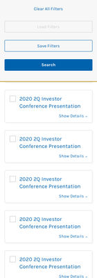
Although this project may appear to be just a simple search page, it involved several additional workflows and the establishment of all necessary breakpoints for technical reference. This practice was standard in nearly all of my work with Morgan Stanley. Here, I present the basic workflow for desktop (1200px), tablet portrait (768px), and mobile portrait (320px). Layouts were also created for the landscape views of both tablet and mobile devices.
I would like to clarify that although this project should have been designed with a "mobile-first" approach, the desktop view had been available to users for some time before I joined Morgan Stanley. The initial request was to update, enhance, and refine the desktop experience, after which the project was expanded to other screen sizes.
Responsive design is a fantastic thing, and after spending four years at a company where everything needed to be responsive, it became second nature for me to build the experience, regardless of whether users would be accessing it on devices other than a desktop. This allowed an easy transition from one screen size to the next.
This project is a few years old, and while breakpoints have changed, its responsive nature allows for easy updates to accommodate future screen sizes.
Comprehensive projects like this truly remind me why I enjoy my work. The desktop view offers plenty of space but is limited in terms of mouse interactions. In contrast, mobile and tablet views have less space but allow for more engaging interactions. As the screen size decreases, the focus shifts to determining what is most relevant to the user at any given moment and whether they will be swiping, scrolling, or tapping to access their next piece of information.
Thanks for reading.


