The Resume
The Resume
The Resume

Pru Design System
An enterprise-wide point of design truth from color to code.
Key Problems
-
No primary design guidelines for digital experiences
-
Twelve different color palettes in use; none of which were for specific divisions or departments
-
Inconsistent use of existing brand guidelines, which were based on print marketing
-
Inconsistent coding practices
-
Inconsistent or non-existent ADA practices
-
Inconsistent or non-existent use of best practices for web or mobile
-
The company website and micro-sites were inconsistent in the use of responsive design practices
The Solution
-
Using the Atomic Design method as promoted by Brad Frost, create a system using consistent elements, modules, components, and page layouts
-
Standardize color and font usage, as well as tone, voice, and logo usage
-
Coordinate with the corporate branding team in connecting the online presence with external media
-
Comply with ADA standards
-
Collaborate with business units to either create new or rewrite content specifically for web usage
-
Create the system to be 100% responsive
-
Build the entire system with a CMS to expedite time from concept to launch, and reduce the workload on the UX department
The Results
-
30% reduction of time from project brief to launch, allowing Prudential to launch before their competitors by a significant margin
-
One point of truth for all design work, allowing a Prudential division to hire their own UX team or contractors to fulfill their own needs without running the risk of being inconsistent or non-compliant with ADA
-
Simplification of UX enterprise-wide, allowing a more seamless and intuitive experience for both authenticated and non-authenticated customers
-
Allowed the UX department to focus on new interactions (online calculators, etc.) and a better overall UX and CX experience for users and customers, without forgoing the daily web page requests
-
25% reduction in training time for designers and developers
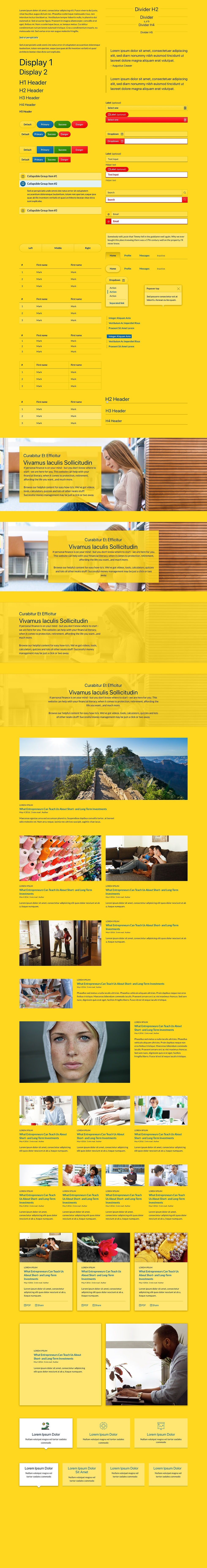
The Prudential Design System. To be honest, there is so much that could be said about this that it’s hard to know where to begin or end.
It took approximately four years to implement the project across the entire enterprise, after which we aimed to rebuild, audit, and expand our efforts. This required collaboration among various teams, including UX, UI, IA, user research, and front-end developers. The initiative received support from leadership levels, all the way up to the C-suite, to ensure its adoption across all Prudential business units. Additionally, the framework was not only utilized for digital experiences but also referenced by designers working on print, video, and other media formats.
My initial redesign of the higher-level pages of Prudential.com laid the groundwork for our system. By combining it with a content management system (CMS), a component library, and a solid understanding of UI and UX patterns, the design team was able to move from concept to launch in just a matter of days. This approach proved to be a powerful tool in our design arsenal, with the potential to be even more effective. Although it was a significant product in its own right, it wasn’t recognized or treated as such.


My role in this project, aside from my design serving as the catalyst, involved continuously updating the user interface (UI) of the system and acting as the primary point of reference for all UI-related questions from various departments, including business, marketing, development, and compliance. Additionally, I was responsible for managing the UI team and leveraging their talents to enhance and improve the system as trends and technology evolved. I also ensured quality control; all work produced by the UI team had to meet the system's standards. Whenever system alterations were needed, I represented the team in collaboration with the Director of Front-End Development (FED) and the Vice President of User Experience (UX) to ensure proper modifications, updates, and implementations.
In 2018, I was tasked with re-envisioning the system from a UI perspective. To avoid conflict, my manager requested that I redesign everything to create a more cohesive and recognizable Prudential look for our components. The original system was built using Bootstrap, but it incorporated too many Bootstrap elements and not enough of Prudential's branding. The UI designers and I invested significant effort into the redesign; however, it was never implemented.
Presented here is my work redesigning the Prudential Design System. If you'd like to see the system prior to the redesign, you can visit Prudential.com. Browse through the various pages to observe the recurring patterns, themes, and components.
Thank you for reading.


A hero component from each of the original four colored themes; Pru Blue, white, grey and Pru Navy; 12 columns-wide, left-justified. One of many components of the Prudential Design System.